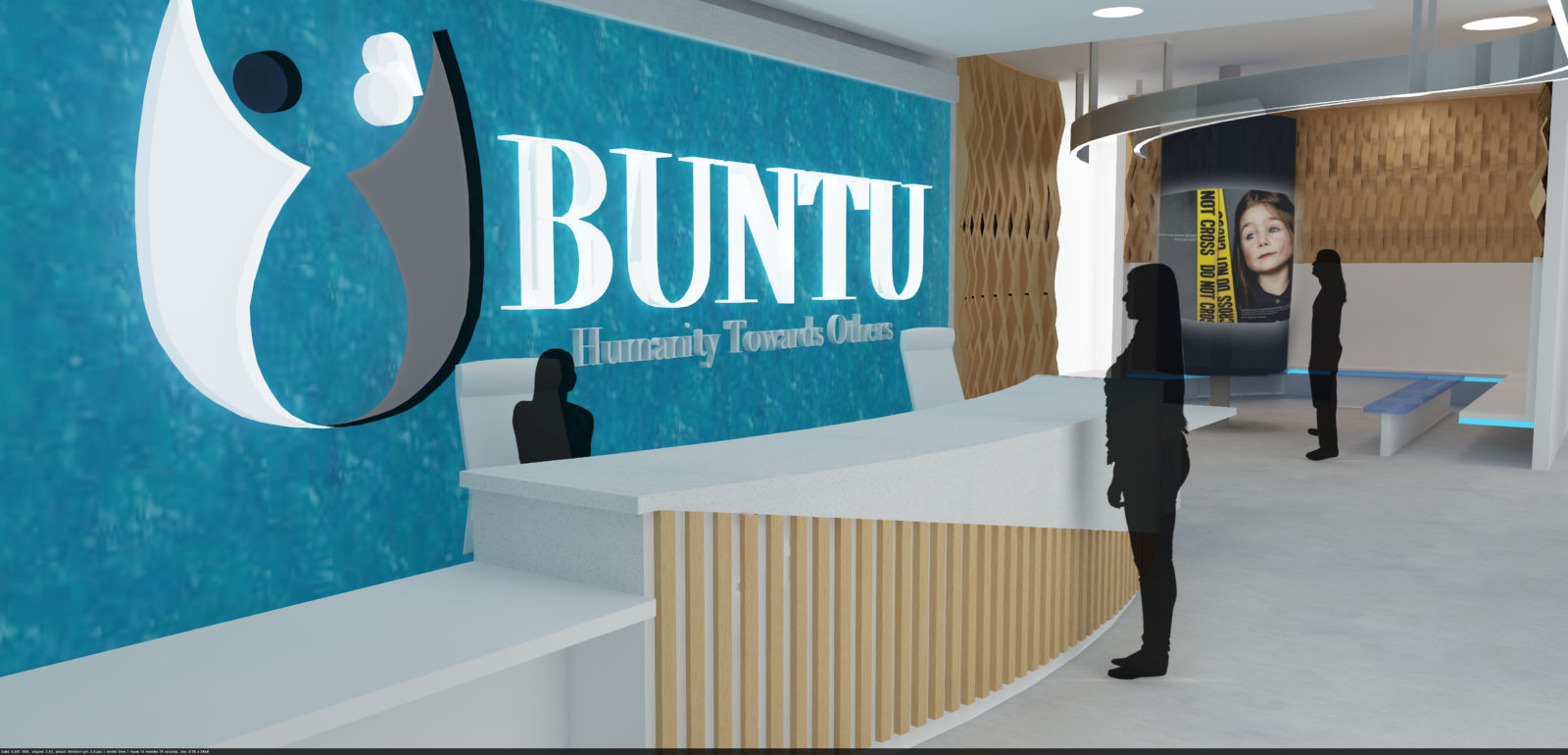
This was a 20,000 sq.ft. corporate design project located in Calgary, Alberta. The task given was to conceptualize an advertising agency and create a design solution based on the program outlined as well as the existing building shell that was given. The concept used for the design was “Cascading.” This was drawn from the way that ideas seemingly cascade from thought to creation to implementation. The word “Ubuntu” has two meanings “I am because we are” and “Humanity towards others”. As such, this advertising agency caters towards companies that promote the welfare of human beings and the environment, companies such as the United Way and The RedCross.
Design Concept
The inspiration for this design was pulled from the idea of water cascading in a waterfall. The reason this was done was because just as water travels from waterfall to estuary to sea, ideas and messages travel from conceptualization to implementation to hopefully impacting many. The agency has realized the power that thoughts can have and chooses to use their creativity and message to impact others in a positive way. As a firm believer of the need to live in a space that embodies your values and inspires you to work, I wanted to conceptualize a design that complimented the agency’s core values. This meant creating a space that highlighted the importance of the message in advertising. I wanted it to be that when people entered the space they too felt as though they were cascaded through it.
Program of Facility
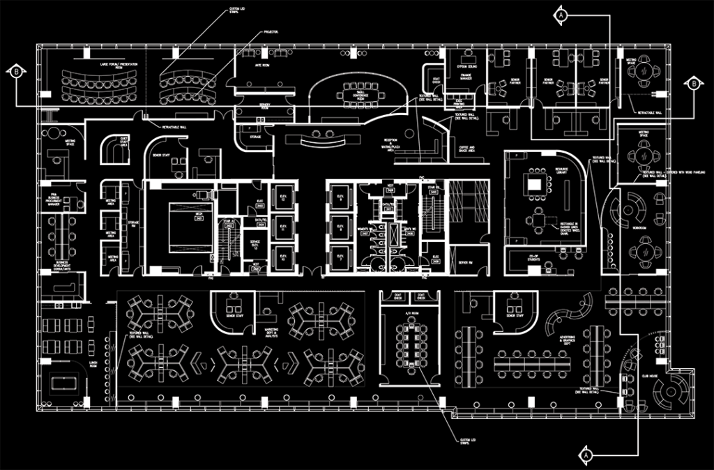
The facility features a reception and waiting area, private office spaces, work spaces, collaborative zones, an advertising department, a marketing department, private work areas and a kitchenette.
Design Software Used
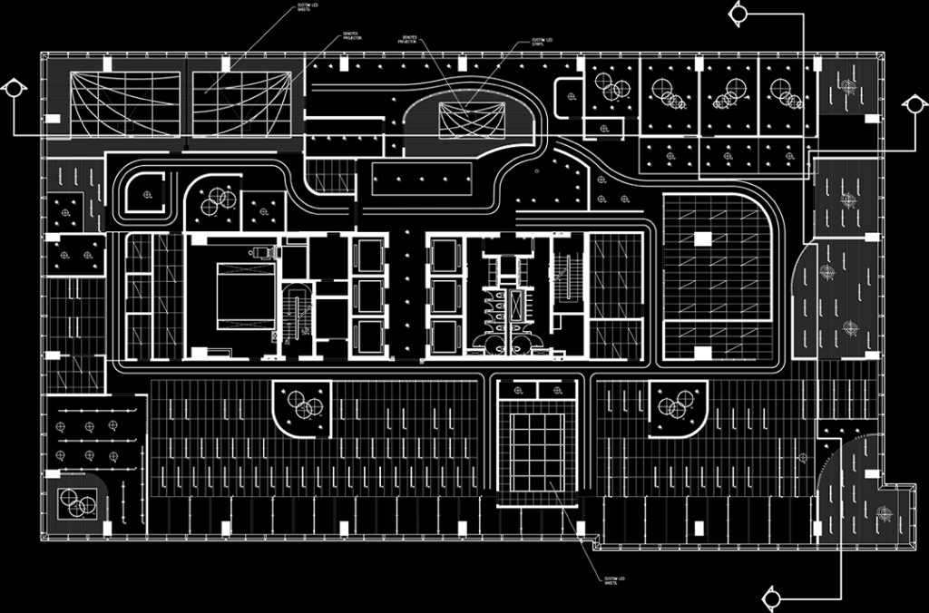
- AutoCAD – For the initial spatial planning and the generation of the reflected ceiling plan
- Sketch Up and Podium – For the creation of the 3D model of the building as well as the generation of the various interior renderings.
- Adobe Photoshop – For the final adjustments to the renderings.
Layout & Materias
The space predominately features a neutral palette with the use of the accent colours of aqua and green. These accents were selected to underscore the idea of nature. The heavy use of maple wooden grille and wooden slats throughout the space also underscore this idea. Overall, I wanted to create a fluid space that fosters creativity and that embodies everything that the agency stands for. The use of curvilinear lines and the manipulation of materiality, throughout it, helped me to achieve this.
Floor Plan – NTS
Reflected Ceiling Plan – NTS
Key Areas
Area # 1: The Reception & Waiting Area

Area #2: The Small Conference Area

Area #3: The Large Forum Area
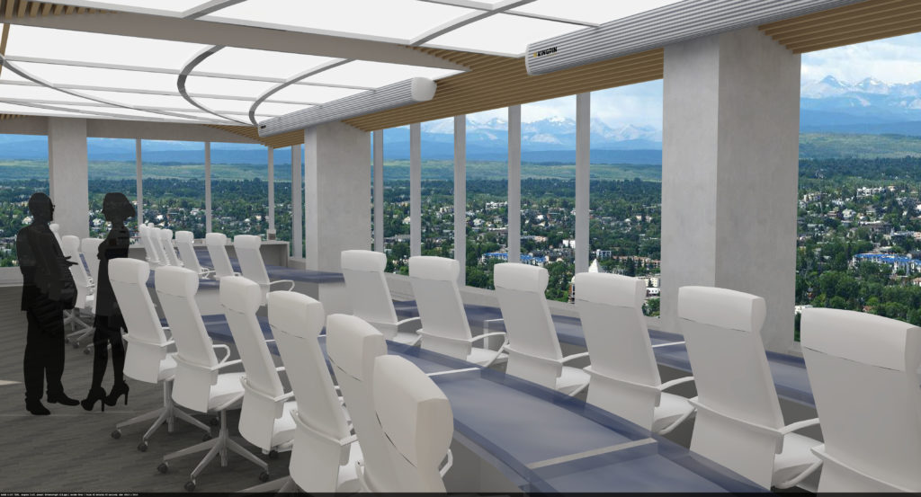
Area #4: The Marketing Department
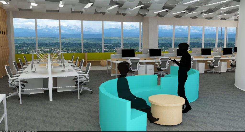
Area #5: The Advertising Department
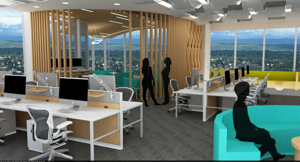
Area #6: The Club House
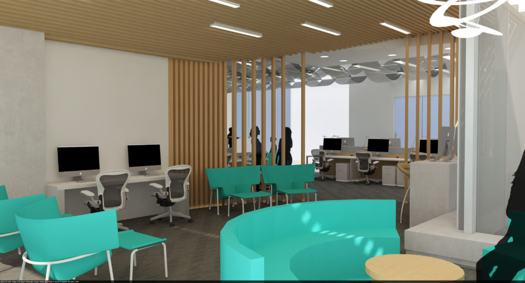
Challenges Faced
This was the first large scale project that I had completed using SketchUp so it was really a learning process for me. However, I really did appreciate the experience and it was one of my most enjoyable projects to date.
