The task, for this project, was to design the layout of a high-end retail company. This project was completed in collaboration with Rachel Birch & Bharhavi Selvanathan. The brand being designed for was Dior.
Design Concept
The Design Concept was drawn from Dior’s runway shows. Their shows are very iconic and dynamic and we wanted to simulate that type of environment within the store. The aim was to allow patrons to feel as though they, themselves were in a runway space and to empower them to feel confident.
Program of Facility
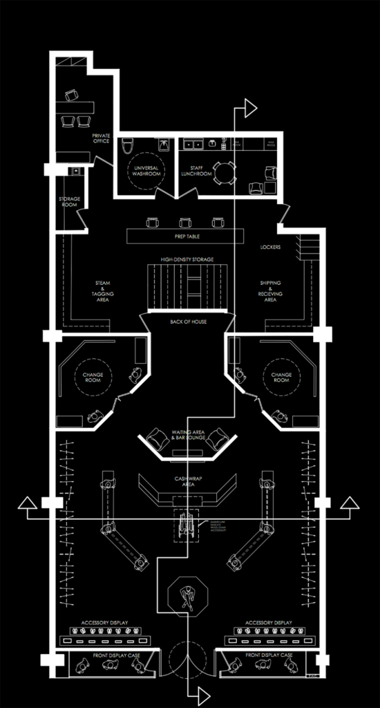
This space features the main store area, a cash and wrap space, changing rooms and a back of house for storage.
Design Software Used
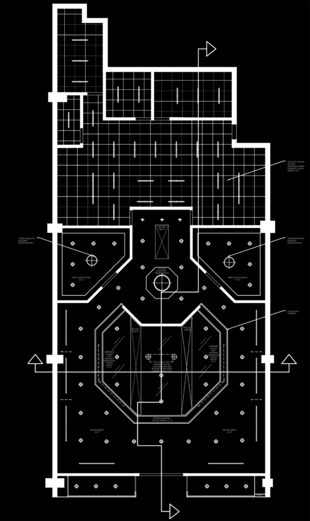
- AutoCAD – For the intial spatial planning and reflected ceiling plan.
- Revit – For the final interior renderings were also completed in Revit.
- Adobe Photoshop – For the final touch up of each of the interior renderings.
Layout & Materials
Dior is known for their iconic runway fashion shows and the aim was to make the interior space feel like a it was a runway for the patrons who entered the space. The colours were inspired by Dior’s 2017 spring collection.
Floor Plan – NTS
Reflected Ceiling Plan – NTS
Key Areas
Area #1: The Entry/Storefront
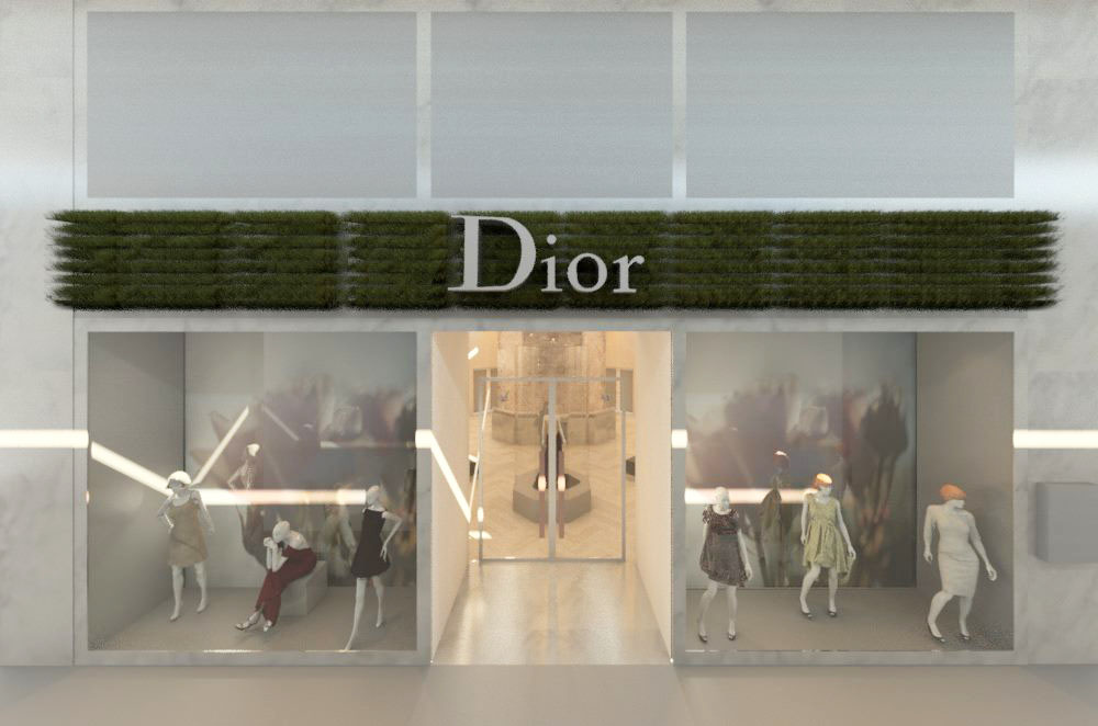
Area #2: Main Store Area (View #1)
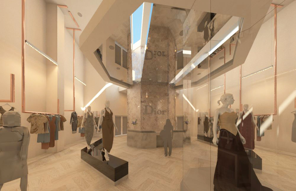
Area #2: Main Store Area (View #2)
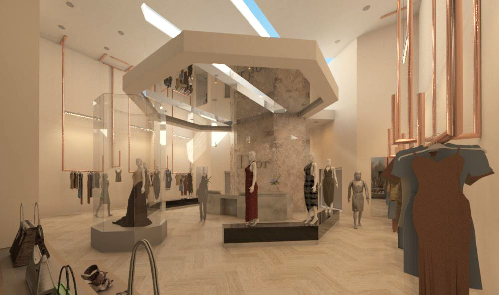
Area #2: Main Store Area (View #3)
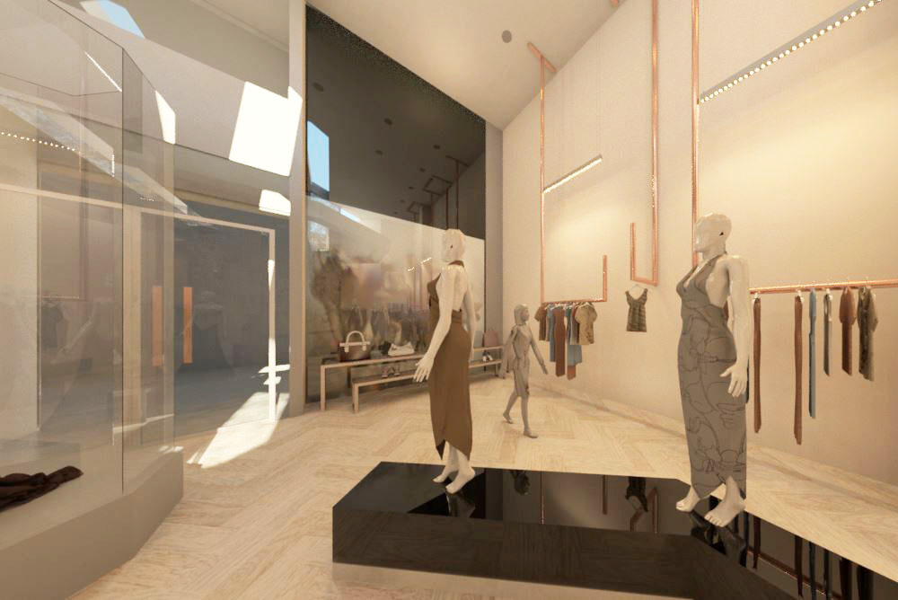
Area #3: Waiting Area by the Changing Rooms
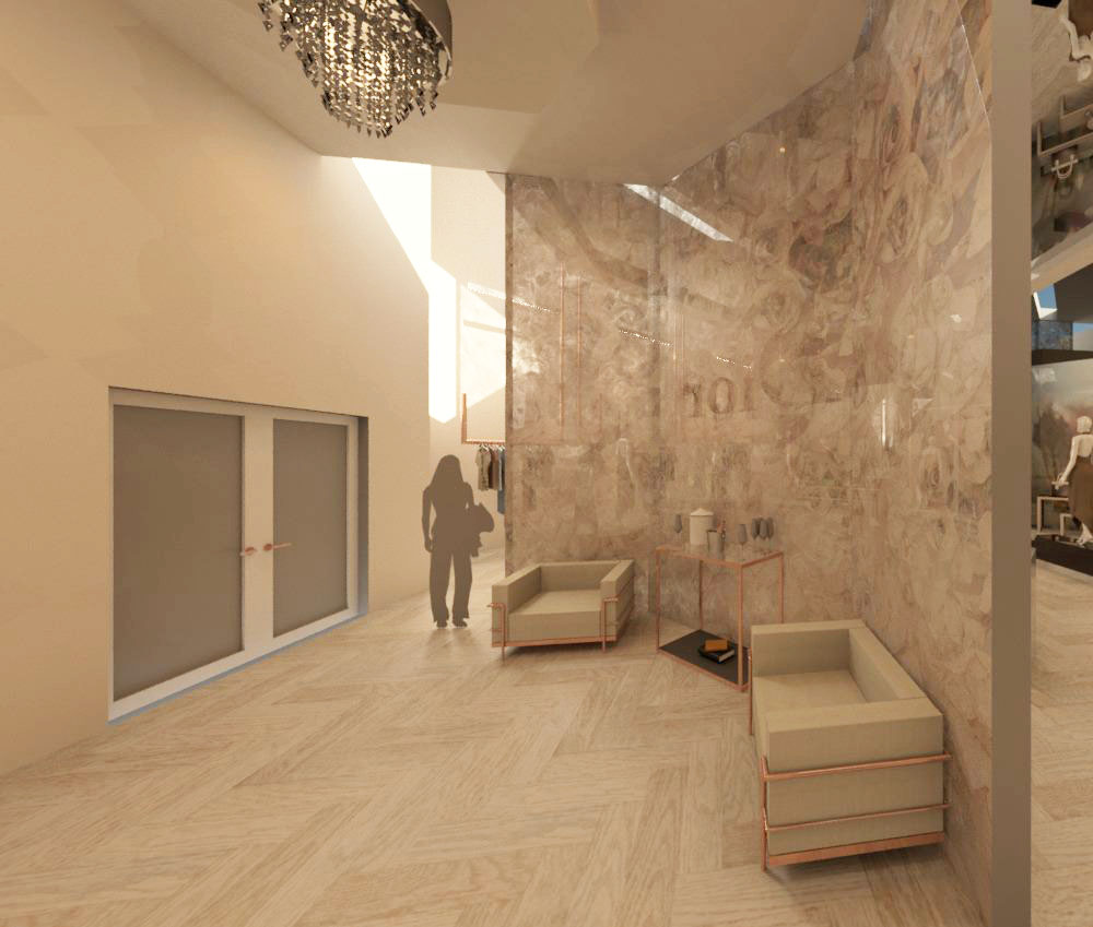
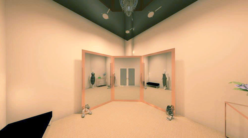
Area #4: Changing Room #1
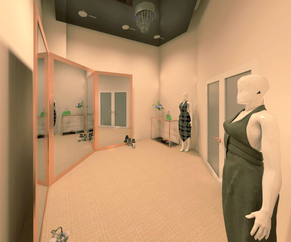
Area #5: Changing Room #2
Challenges Faced
This was the first project that we were really using Revit for and it was a bit of a challenge initially as we were figuring out how to really layout some of our spaces and generate renders.
However, it ultimately proved to be a very valuable learning experience and helped us to really begin to understand the software.